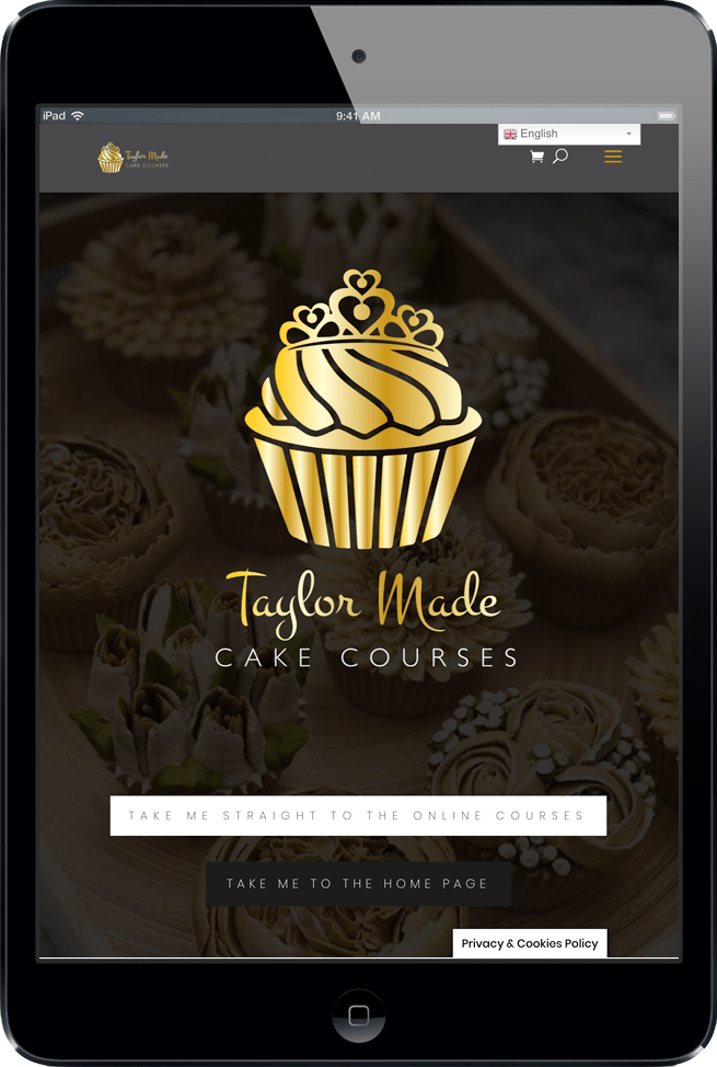
E-commerce WEBSITE
client:
Taylor Made cake courses
INDUSTRY:
baking – online courses

Brief in brief
Client Location – Tenterden, Kent. UK
- Complete brand colour change and logo redesign
- New E-Commerce Website with main focus on Digital Online Courses for download
- Translate option for 30 languages
- Focus on consumer functionality
- Transfer over 2000 existing account holders details
- Full copy rework & implementation
- Social Media & Mailing List management and promotion for new website
Categories
- Web Design
- Advisory
- Digital Marketing
- Social Media
- Branding
- E Commerce
- Downloadable/virtual product catalouge
- Videography
CLIENT FEEDBACK
‘I love the timeless and classic new branding, the black and gold is so classy. I also love how the site is so easy for my students to use and the translation option is amazing! I love it all!”
JANE TAYLOR
THE BRANDING


User Experience Research
Client had an existing focus group from a Facebook group set up previously by Rockpool. This was used as a great tool for Rockpool to ensure any troubleshooting issues were entirely eradicated before it came time for the hard launch.
Brand Redesign
The client’s existing branding was used for an additional sector of the brand, direct cake sales. The client felt that a new version was required to separate her cake courses business.
The client gave colour preferences which we worked into the existing logo to create a strong identity with graphic foil effects applied. This was then utilised in print when we created foil finish printed business cards for the client.
Focus on functionality
This well known brand’s previous website was quickly outgrown by the vast quantity of national and international traffic received daily. With over 2000 active site members, the overall safety of the member data was absolutely imperative. Additionally the large video course library held and sold by the client required accurately allocating to the existing members.
LET’S CREATE SOMETHING EXCEPTIONAL TOGETHER!
Not in the mood to talk? Ping us a whatsapp to get started!
07912 760044


The Process
Client OBJECTIVES
- Make the website more user friendly for international visitors.
- Achieve higher level functionality
- Achieve full responsiveness
- Overall user experince must be more linear.
- Branding evolution
Full Platform & Plugin Research
Working out which platform and plug ins would work best for the company and why.
- Brand Integrity
- Cost
- Functionality
- Ease of use
- Versitility
Full Social Media Campaign for relaunch
Full digital marketing strategy for new website including but not limited to:
- Facebook/Instagram retargeting adverts
- Mail shots
- Blogs
- Organic posts across all channels
Added Extras
Client requested new business cards & new domain related email addresses with setup and integration.


